Dublik — naming and packaging design for sandwich cookies in Uzbekistan
1. Task
In the highly competitive FMCG market, launching a new product requires not only a great recipe but also a well-thought-out brand platform. The client commissioned us to develop a naming and packaging design for a new sandwich cookie with a cream filling. Our goal was to differentiate the product so that it would not simply find a place on the shelf, but would seamlessly integrate into consumers' daily lives, becoming a distinctive visual attribute.
2. Study
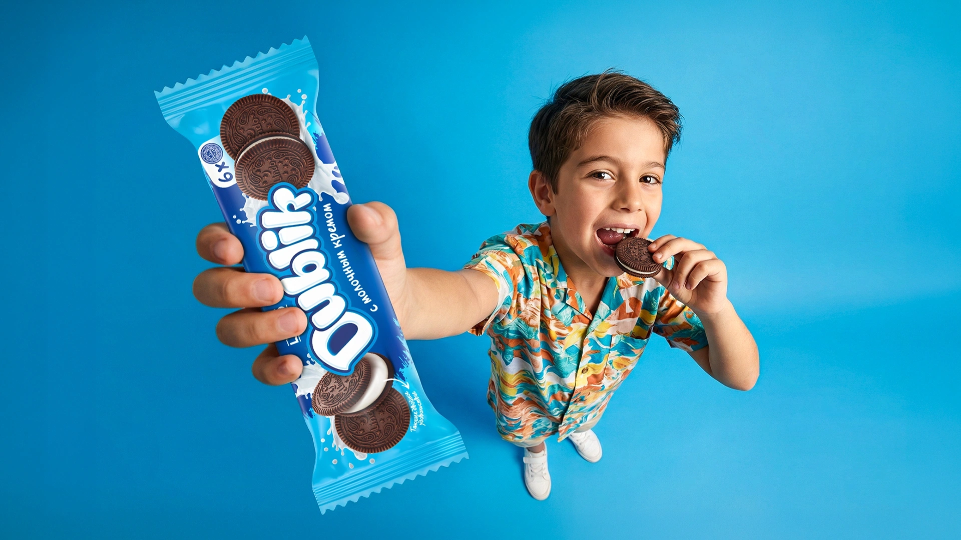
We began our work with an in-depth study of the market, consumer behavior, and potential audience. Our analysis revealed that the product's core target audience would be children, teenagers, and, above all, girls. Visual aesthetics and self-expression are extremely important to today's younger generation. Girls love using bright, Instagram-worthy packaging in selfies and showcasing beautiful details against their desktop backgrounds.
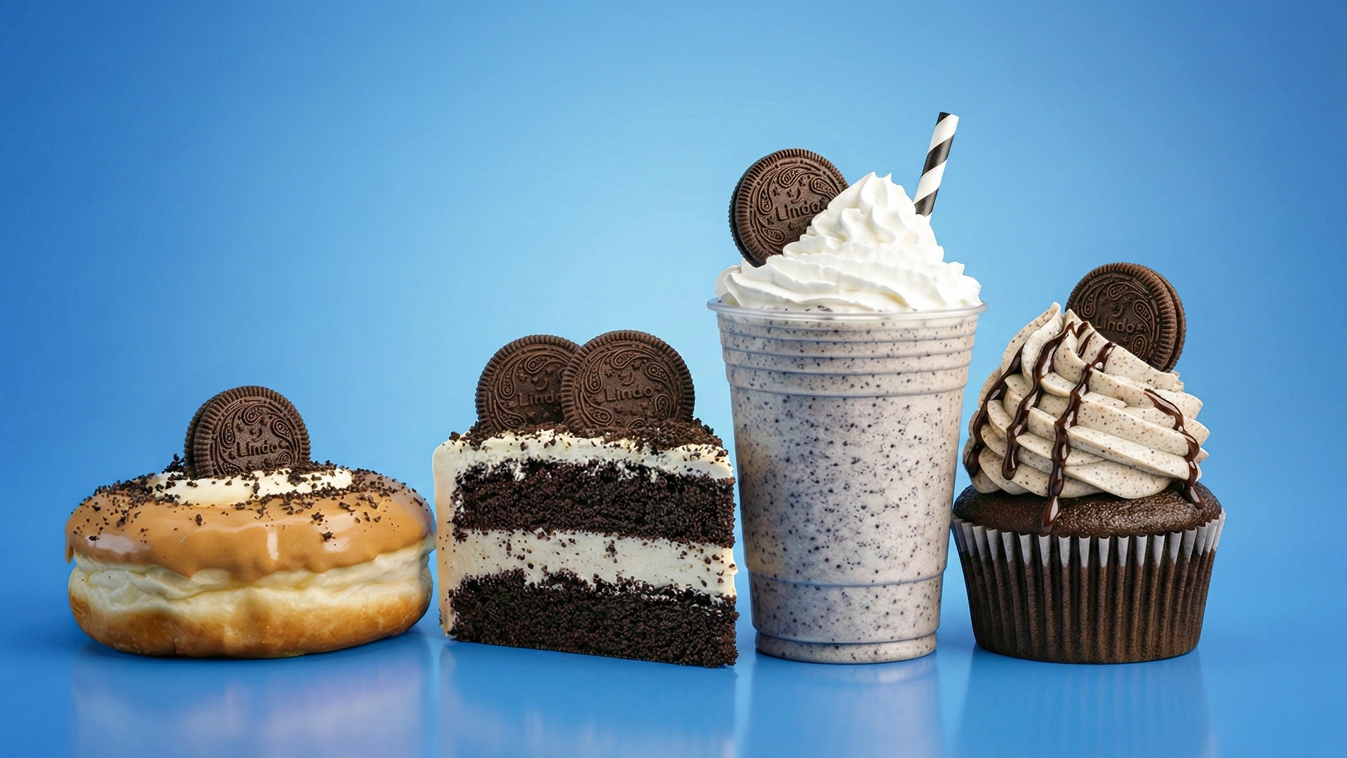
It became clear that, in addition to its functional properties, the product needed to be a fashionable accessory for social media. This, in turn, required a strong emotional trigger that would stimulate the natural generation of user-generated content (UGC).
3. Solution
We took a comprehensive approach to the project:
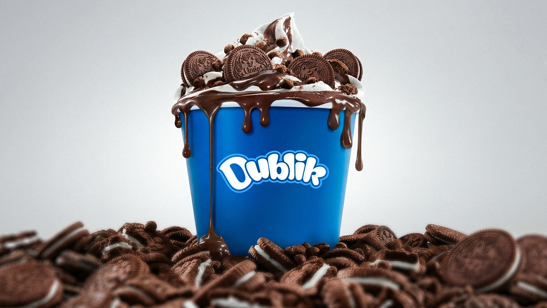
- Verbal Identity (Naming): We named the brand "Dublik." It is formed from two roots: "double" (referring to the concept of double cookies) and the diminutive suffix "-ik." The name has a warm, easy-to-pronounce sound and sets a friendly tone for brand communication (Tone of Voice).
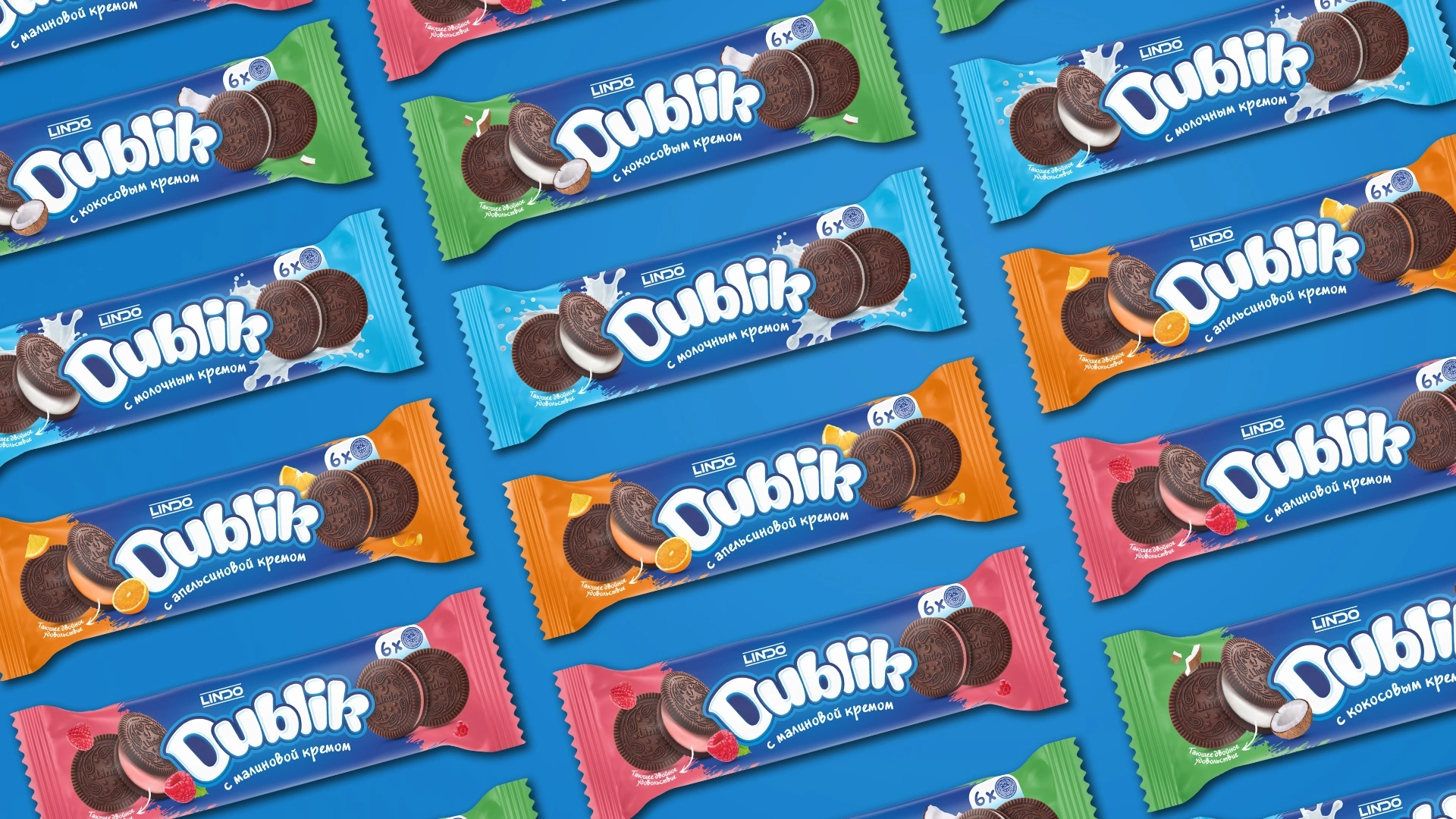
- Visual Identity (Packaging): The packaging design is dynamic and visually striking. A unique color palette and visual code were developed for four flavors: milk cream, coconut, orange, and raspberry.
- Adaptation: Considering the 4- and 6-pack packaging formats, we developed designs for a total of 8 SKUs within the brand line.
- Trade Marketing: To ensure the product stands out on shelves and encourage impulse purchases, we designed display boxes, shelf talkers, customized price tags, and other special B2B and B2C materials.
Result
The project was successfully completed, and the brand is currently preparing for launch. The developed visual concept and brand platform have been fully approved by the client. Our visual and emotional hypothesis proved 100% successful: the resulting design laid a solid foundation for the product to soon become a vibrant backdrop for youth selfies, an aesthetically pleasing desktop detail, and a trendy accessory for consumers.