Panda – Export-Level Packaging Design
Packaging design for export-grade washing powder
1. Task
Today, the business landscape in our country is changing rapidly: new brands are popping up like mushrooms after a rain. Production is growing, and competitors are breathing down our necks. In such a climate, entering the market with a "run-of-the-mill" product is an unaffordable luxury.
Good, catchy names have long been taken. Our client managed to achieve the near-impossible—patenting a strong name, "Panda," for a laundry detergent. With this introductory idea, they approached the Minim agency.
However, a catchy name is only half the battle. Without a proper "clothing," it won't work. We had an ambitious goal: to transform a simple word on the packaging into a reliable assistant trusted by every housewife.
There was a risk: if presented incorrectly, the name "Panda" could evoke associations with children's toys or the low-end segment. Our goals:
to convey the product's value through visuals;
to work on the principle of "love at first sight," evoking warm emotions;
to distinguish the product from the "visual noise" of competitors on the shelf.
2. Research
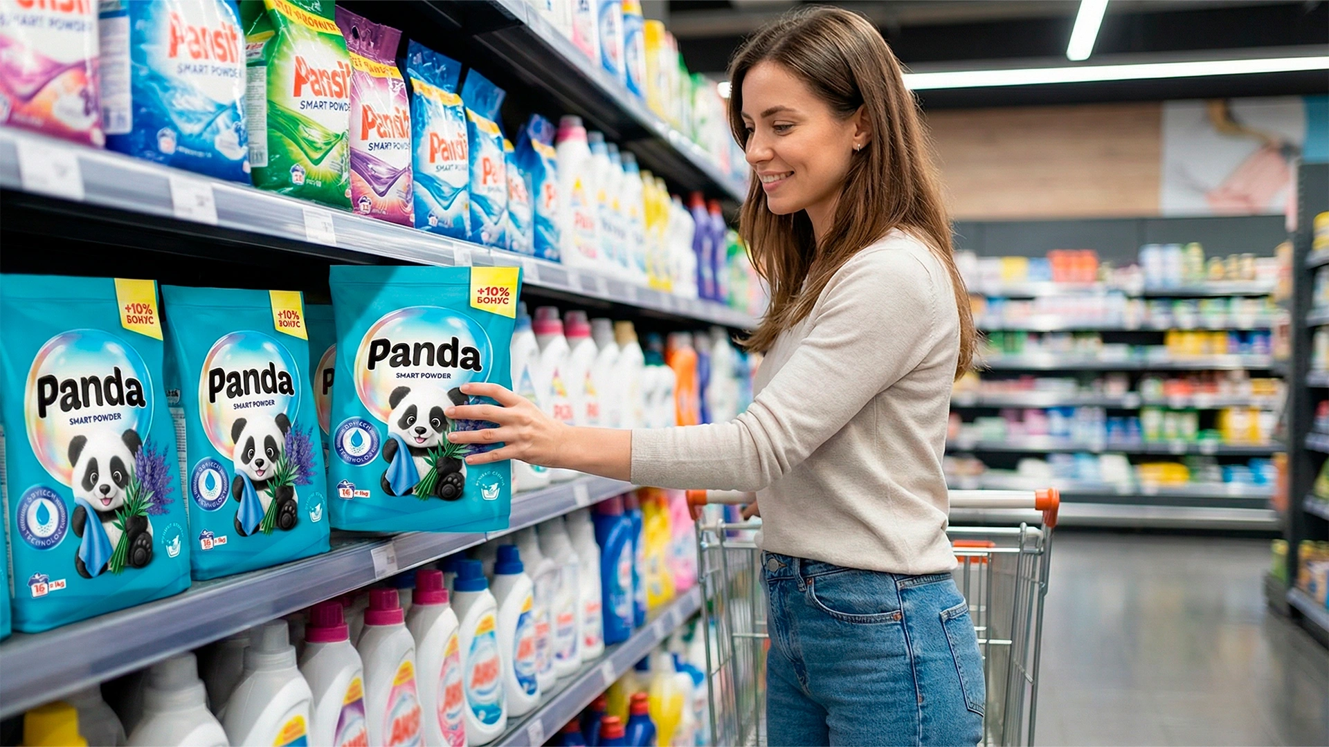
We conducted a shelf analysis: the market is oversaturated with bright, aggressive colors. Every brand is trying to outshout the others, creating visual fatigue.
We needed a color that would "speak" without shouting. So we came up with turquoise—the color of calm and trust.
-
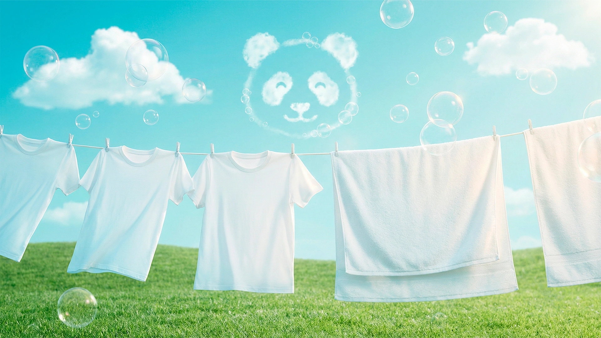
Conveys softness and gentleness when washed.
-
Subconsciously communicates safety for fabrics.
-
Associated with a fresh, unobtrusive scent.
But the main distinguishing element wasn't the color.
3. Solution
To avoid being overwhelmed by the mass of identical packaging, we needed a "guide" who would find a common language with the customer. We entrusted this role to a mascot (brand character).
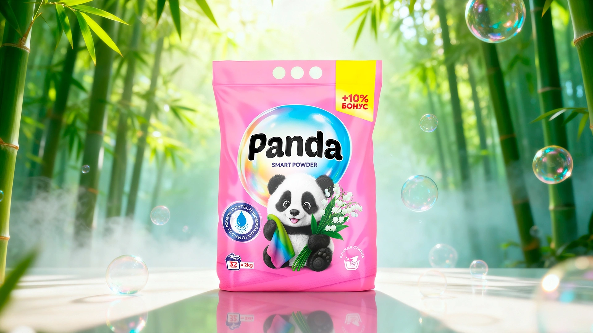
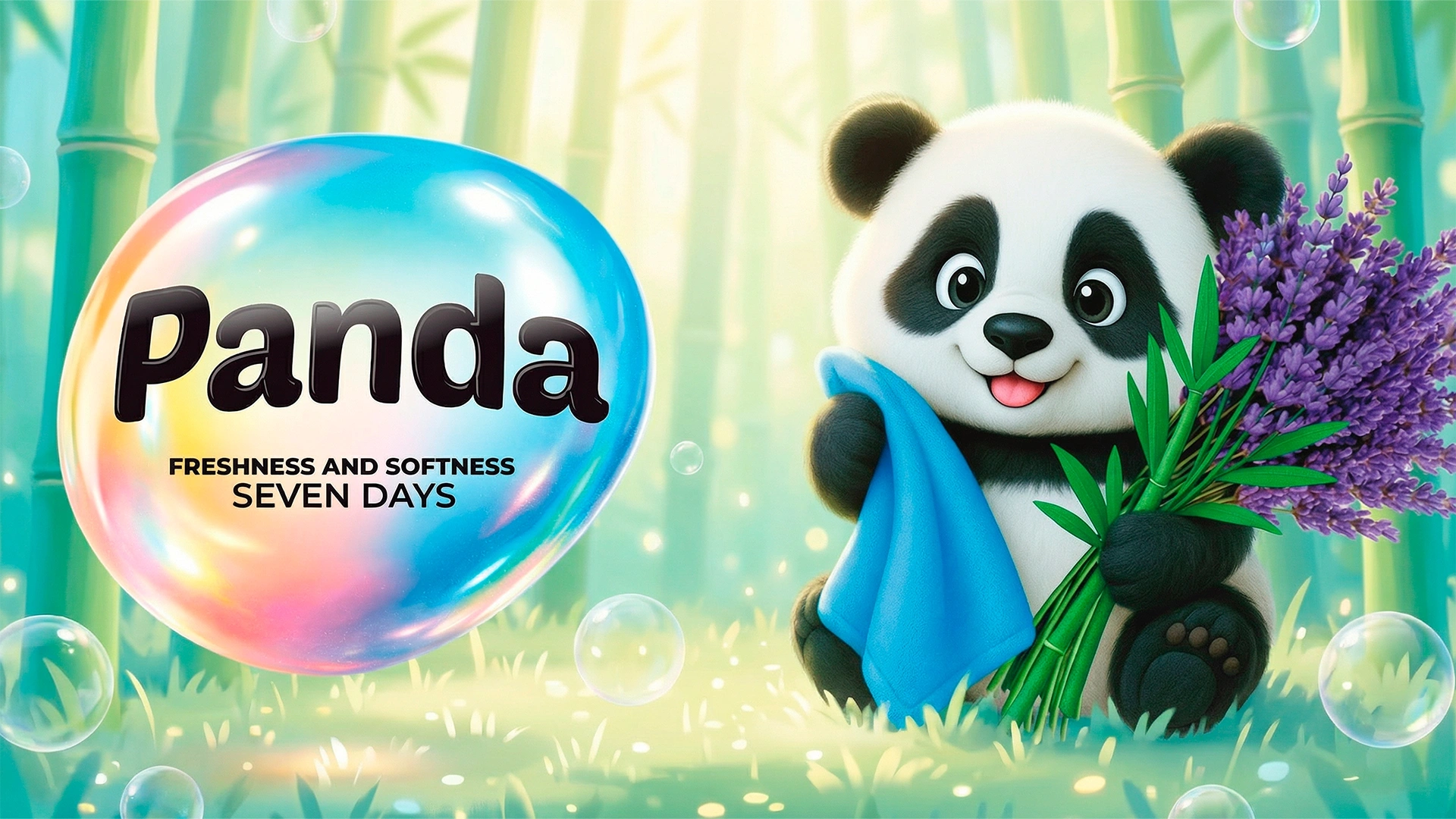
- Mascot: The name dictated the decision—a panda, of course. But not just any animal, but a character with personality. Our Panda holds a soft towel and flowers in its paws. This nonverbal message: "I will take just as gentle care of your clothes." This removes the barrier of mistrust. The customer may forget the name, but they will definitely remember "that very same powder with the panda."
- Architecture: To confirm our expertise, we used special icons (brands) in the style of "DryTech Technology." This is a signal to the rational part of the brain: inside— Modern technologies.
- Navigation: We've developed a color code for each fragrance (Lily, Iris, Lavender, Chamomile). This simplifies selection and creates a beautiful, eye-catching row on the shelf.
Result
The synergy of competent design and a high-quality product produced an effect that exceeded expectations. We hit the mark:
- Thanks to the turquoise color and charming character, the product immediately found its audience.
- The design categorically distanced itself from the "cheap" image, so customers tried the new product without fear.
- The brand not only established itself in Uzbekistan but also successfully entered Kyrgyzstan and Tajikistan, where distributors have already established distribution channels.
It's not for nothing that they say: "They meet you by your clothes." In a crowded market, being "like everyone else" means losing. Only by having something unique and distinctive can you make customers recognize you among hundreds of others. The Panda brand is a clear example of this.